Simplified Search Flow: New York Cares
- archanaravi42
- Jun 28, 2019
- 3 min read
Updated: Dec 2, 2021
Team
Jihye Woo, Tinu Theresa Thomas, Yi Chen
My Role
UX designer, UX research
Tools
Adobe XD
Final Product
Interact with our Prototype here

Design Problem
How might we provide a quick search experience for volunteers to find the right volunteer opportunities quickly?
Project Overview
New Yorkers who are interested in giving back to the community can find volunteer opportunities via New York Cares, one of the most renowned volunteer organizations in New York City.
However, overly heavy content and information architecture make it hard for users to navigate the website and find volunteer opportunities.
How does the New York Cares website provide an easy search experience for them?
Project Goals
Improve the navigability of the New York Cares site as it pertains to finding volunteering opportunities
Modify the information architecture to be more intuitive
Understanding The Stakeholder Needs
The New York Cares team wants to enhance the website’s user experience to bring more volunteers to the community.
I kicked off the project with a stakeholder meeting that included the UX designer and the tech director at New York Cares to understand their needs and concerns, and ultimately to build consensus for the new design.
The New York Cares website hasn’t been updated since 2012 due to the shortage of staff and technical problems. Thus, the New York Cares team wanted to enhance the website's experience by improving user-friendliness to bring more volunteers to the community.
Understanding The Users

The main motivation for volunteering is to meet new people and interact with them. I met potential volunteers in person at the orientation to hear what motivates volunteers and what they expect. Among a total of 42 volunteers , the majority of the attendees were in their 20s to 30s. They are eager to volunteer because they want to engage with their community while connecting with people.
“Although my life is busy, I want to do volunteer. Because I love meeting new people through volunteering!” — Kate, Orientation Attendee & Recent Grad
Competitive Research
Providing proper content on the homepage and a simple navigation bar is important to users for a quick search.

I identified 27 different websites that can be the client’s direct and indirect competitors, then chose six different organizations to review in-depth. Then, I defined 10 dimensions to focus on during the competitor research. Those dimensions reflect both an understanding of the client’s needs and the expectations of our users. After that, I conducted a systematic review of each competitor with respect to each dimension. Through the review, I looked for noticeable patterns and identified some key takeaways and recommendations for our client.
Wireframing

Initial wireframes allowed my team to ideate the main features and content structure. Based on various series of research, my team created some hand-sketched wireframes that outline the key interactions and content.
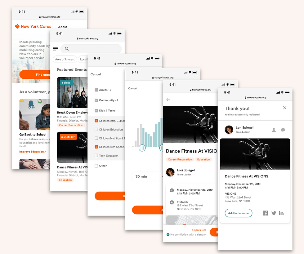
Final Design


Validating the Design Choice
Users found volunteer work on our new design two minutes faster than the old website during the usability testing. In addition, I conducted an on-site usability test with early wireframes to assess the usability of new information architecture and interface design. Users were asked to complete two tasks: find and register for a volunteer event. Some of the results were-
All users said the new prototypes looked clear and easy to use.
Most of the users completed two tasks 2 minutes faster than the previous website.
I Developed and refined every single element that aligns with the test results. After iterative design processes, my team finalized the prototype in line with usability test results and the client's guidelines.
Introducing new design solutions
An effective filtering system showing users’ ideal events faster than browsing.
Personalized recommendations based on the user’s profile.
Register with social accounts to enable social integration functions.
Message to other participants for more social engagement.
Browse volunteer works easily with a mobile-friendly user interface.
Reflections
Redesigning a UX of the website introduced me to the impact of user research on improving real users’ lives.
After conducting thorough research of our users over the past four months, my team presented the final design to the client. Our client couldn't have been happier with our progress and attention to detail, and they are eagerly planning to implement our design into their current website. This project focused mainly on the tasks of finding and joining volunteering activities. Further research can be conducted on challenges such as increasing donations, making the website more accessible for nonprofits.

Comentarios